The HydePHP UI Kit is a collection of minimalistic and un-opinionated TailwindCSS components for Laravel Blade, indented to be used with HydePHP. Note that these components may require CSS classes not present in the bundled app.css file and that you may need to recompile the CSS file using the included Laravel Mix configuration.
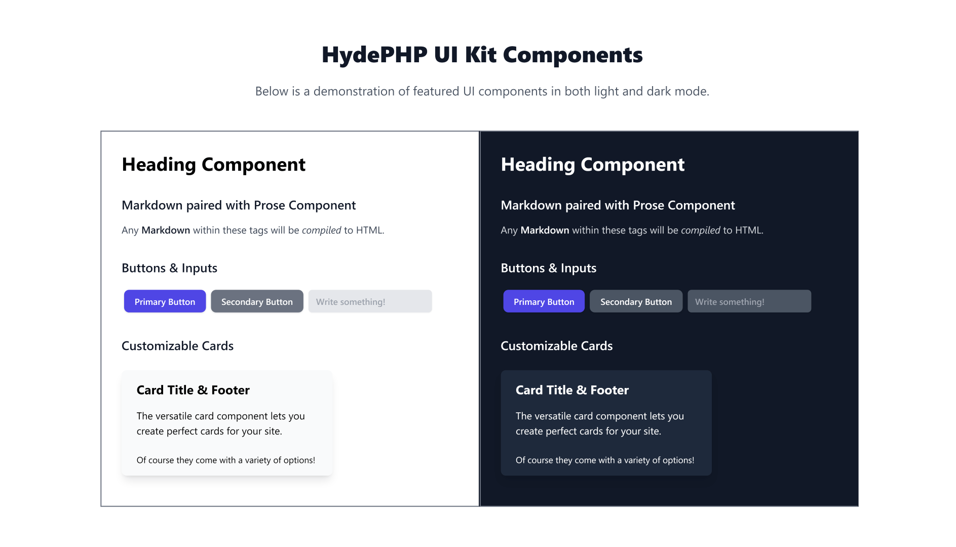
Screenshot#
Here are some of the components you can use to build your next project! As you can see, all components support both light and dark mode out of the box, just like the rest of HydePHP.
Components#
Please make sure you're familiar with Laravel Blade before using the HydePHP UI Kit.
Tip: Most components allow you to pass any additional HTML attributes to the element!
Buttons#
Primary#
<x-hyde-ui::button-primary> Primary Button</x-hyde-ui::button-primary>Secondary#
<x-hyde-ui::button-secondary> Secondary Button</x-hyde-ui::button-secondary>Input#
The base component is <x-hyde-ui::input />, any additional attributes will be passed to the input element as seen below.
<x-hyde-ui::input type="text" name="name" placeholder="Name" value="John Doe" />Card#
An incredibly versatile component that can be used for a wide variety of purposes.
In the most basic form, a card is just a container with a white background and a shadow.
However, it also supports two slots: title and footer.
<x-hyde-ui::card> A card with some content.</x-hyde-ui::card><x-hyde-ui::card> <x-slot name="title"> Card Title </x-slot></x-hyde-ui::card><x-hyde-ui::card> <x-slot name="footer"> Some footer content. </x-slot></x-hyde-ui::card>Why not combine the components?
<x-hyde-ui::card> <x-slot name="title"> My Amazing Card </x-slot> A card with some content and a footer with a button. <x-slot name="footer" class="text-center"> <x-hyde-ui::button-primary> Primary Button </x-hyde-ui::button-primary> </x-slot></x-hyde-ui::card>Typography Components#
Heading#
This component will create a styled <h1> level heading centred on the page.
<x-hyde-ui::heading> Lorem ipsum dolor sit amet.</x-hyde-ui::heading>Prose#
This simple component will create an <article> element with TailwindCSS Typography (prose) styles applied.
<x-hyde-ui::prose> <h2>Prose Heading</h2> <p>Prose paragraph</p></x-hyde-ui::prose>Markdown#
This component will convert any Markdown within it to HTML using the Hyde Markdown compiler.
<x-hyde-ui::markdown> ## Markdown Heading Hello world!</x-hyde-ui::markdown>Tip: You may also want to wrap this in the prose element or the Markdown will not be styled.
What's Next?#
The UI kit is minimal by design. It's up to you to create something amazing, we just want to give you a head start. You can get surprisingly far when you combine the components. Take this newsletter signup card for example!
<x-hyde-ui::card> <x-slot name="title"> Let your creativity flow! </x-slot> <x-slot name="main" style="padding-top: 0; padding-bottom: 0;"> <x-hyde-ui::prose> <x-hyde-ui::markdown> The UI kit is minimal by design. It's up to **you** to create something _amazing_. Maybe create a form to collect newsletter subscriptions? </x-hyde-ui::markdown> </x-hyde-ui::prose> </x-slot> <x-slot name="footer" class="text-center flex"> <x-hyde-ui::input placeholder="Enter email" /> <x-hyde-ui::button-primary> Subscribe </x-hyde-ui::button-primary> </x-slot></x-hyde-ui::card>
GitHub Repository#
You can find the source code for the UI Kit on GitHub at hydephp/ui-kit.